Grid & Column Design System - Ux/Ui Design
Introduction
Keystone Education Group (KEG) consists of 450+ platforms (brands/websites) that act as a hub where soon-to-be students and schools can meet, worldwide. We have two different kinds of users, the schools and the students, both are equally important. The overall challenge with having this many platforms is the need to keep design and development consistent and efficient since the design team is small.
My role
I drove the process forward by doing research and communicating needs with both my design lead and the tech lead. I did the lo-fi mockups, hi-fi prototypes and the final hand-off to the developers.
Quick Overview of the Project
We don’t have enough defined elements and how they should act within a responsive environment. Today many elements are placed inconsistent and unaligned which results in the users getting a harder time overviewing the pages and that might result in lost conversions for us.
To present the concept clearly, I divided columns into 3 screen sizes, naming them small, medium, and large. We decided on the right path at the meeting with the tech lead based on Google Material's recommendations.
Situation
One challenge our sites at KEG has is that we don’t have enough defined elements and how they should act within a responsive environment. Today many elements are placed inconsistent and unaligned which results in the users getting a harder time overviewing the pages and that might result in lost conversions for us.
Since we lack a standard today developers tend to add their own standards which results in uneven and inconsistent designs that over time turn into a mess.
Background
A while back we updated one of our sites with a complete re-design but there was no thought to remove unwished design flaws such as aligning all elements so it gets easier to scan the page.
Known Issues
One example is that one of the pages is set to 1030 px width which causes an issue since it cant be divided by 2. The most logical way of having it would be 1032 px or perhaps 1064 px and so on. This will also be a part of the task.
Goal
Enhance the visual appeal and operational efficiency of our websites through the implementation of a new grid and column system.
User story 1 - As a designer/developer, I would like to be able to use a grid to create a cohesive layout. This ensures consistency across all our platforms.
User story 2 - As a user, I would like to quickly scan the web page for the information I’m looking for.
The Task
Explore and define the grid specifications that are needed to align all elements in a logical manner.
Avoid uneven pixel numbers and always use an even number such as 8, 16, 24, etc…
Stop working with width in percent (%) and start using columns instead.
Key benefits of updating the grid
The improved visual appeal of our websites leads to a more professional and modern brand image.
Enhanced user experience for our customers, which can help increase engagement and conversions.
Streamlined website development process, resulting in faster time-to-market and cost savings.
My process
I began by taking a look at our sites to get a better understanding of what elements were unaligned and I could quickly identify several issues that to me were crucial to solving.
Thereafter I visited Google Material Design and started to read up on their ways of creating a cohesive layout. The long-term goal has always been to strive toward their way of designing.
I took loads of screenshots of our current site and started to explore different screen formats by just dragging the image sizes to my preference. By doing this I got a clearer view of how much of a mess many of the elements were. I also got a better idea of how I wanted to align the elements within my final design.
Visualize the idea
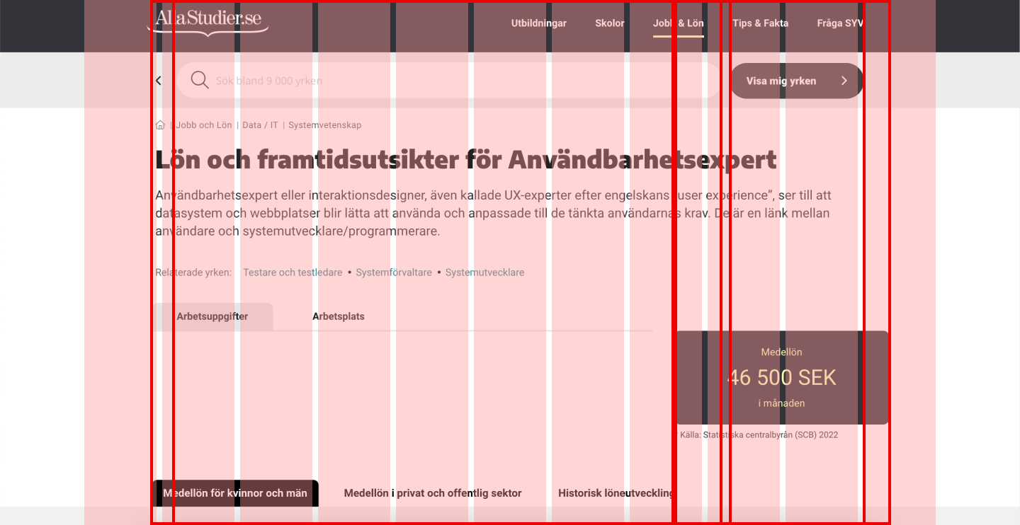
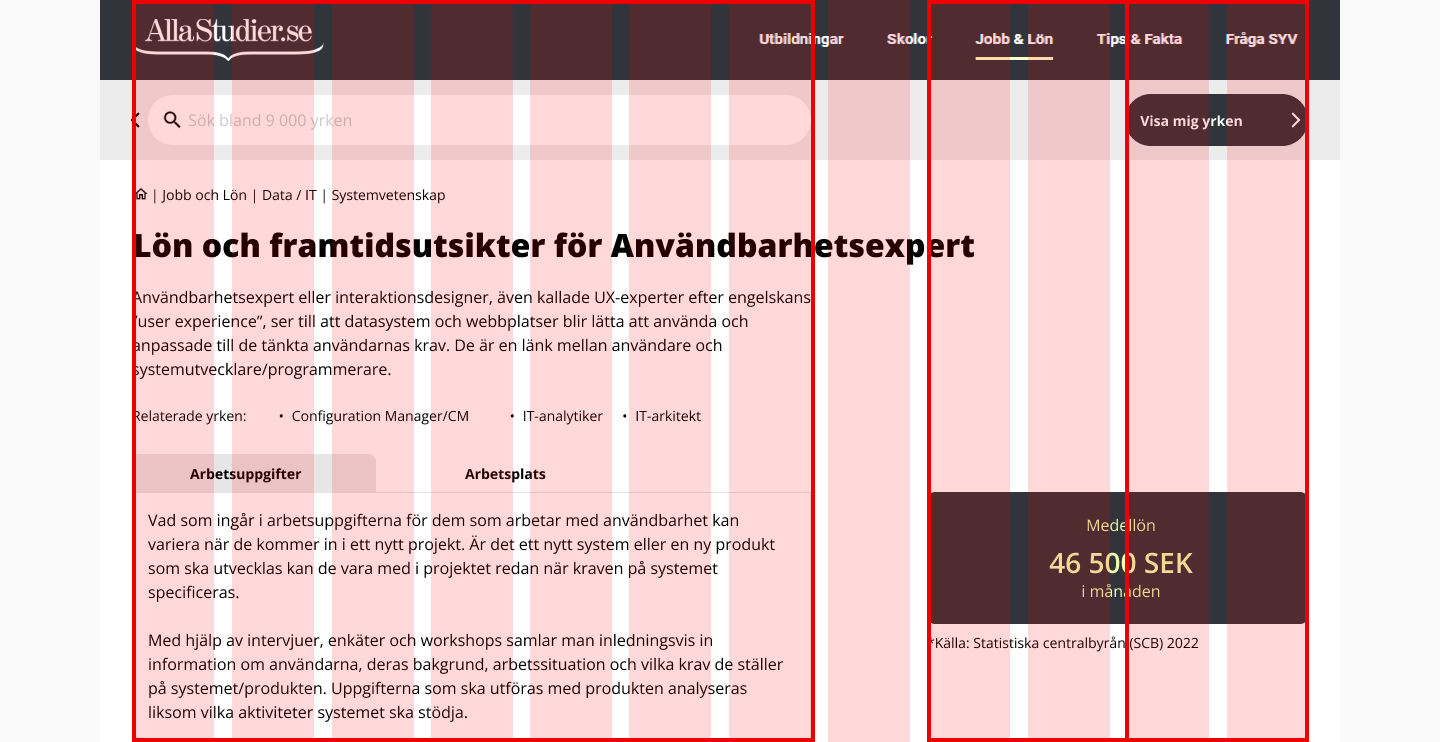
To visualize the concept in a good manner I divided the columns into 3 different screen sizes 4, 8, and 12, and marked how each element would be paired up against each column. By doing this I hoped to avoid any misunderstandings when presenting the concept to our tech department.
At the meeting with our tech lead, we concluded that this definitely was the right path to follow since today’s way of working was not sustainable.
Breakpoints
Something I quickly adapted was to name the different screen sizes, small, medium, and large instead of phone, tablet, or desktop. Doing this minimizes the risk of confusion in the future and is more versatile for many different displays.
Initially, I created 3 different breakpoints, from 320 px - 616 px - 952 px. When passing the largest width only the margins will change. This decision was made based on Google materials recommendations as well as the behavior of one of our sites Masterstudies.com
Creation
The next step was to recreate and define all the elements so that they could behave within the new column system.
Usually, the best practice is to work mobile-first, but since all the actual content already existed I began adapting the desktop (large screen) view. I did this because the main challenge was to evenly spread all elements and on a smaller screen all elements end up on a single row anyway.
Solution/ Summary
To summarise the solution, I created a new 8-pixel grid and column system based on Google Material Design. This resulted in 4 different breakpoints from Small, Medium, Large, and Fixed large to really be sure all users get the best experience when visiting our sites.
This will be applied to all our designs from here on and will save us design time as well as there will be a more pronounced design standard for the developers.
This was one part of a larger re-design project and will work as a solid ground for further development (scaleable). This will also result in a better user experience and save the company money in the long run.

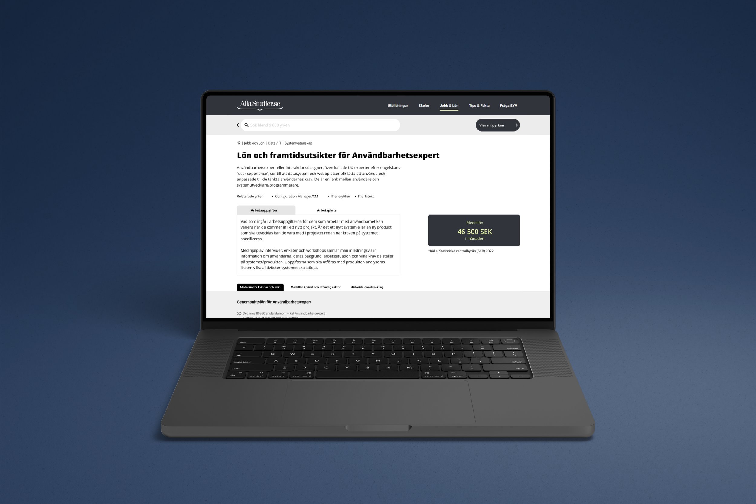
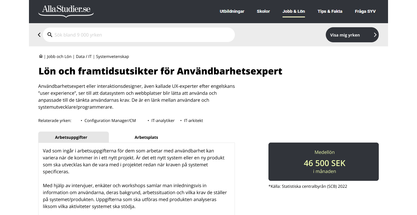
Before

After
The next step
Since we already knew that the current design was deficient I began to create a ticket specification for the developers immediately instead of doing any user testing at this point. This was to speed up the process and when the new column grid finally is live we can then for example create an A/B test and compare the old with the new.
Learnings
Firstly I have learned the importance of always working proactively, planning, and acting ahead of time. This is a large part of the Ux designer’s work and might affect the whole process forward if done badly.
Secondly, I have come to an understanding that there's not one grid/column that fits every webpage. You need to first understand why you should use a grid before deciding how it should be applied to your products. Only then can you create something that fits your user’s needs and that makes the workflow better for everyone within the organization.


